01 — Introduction
Casa Culta
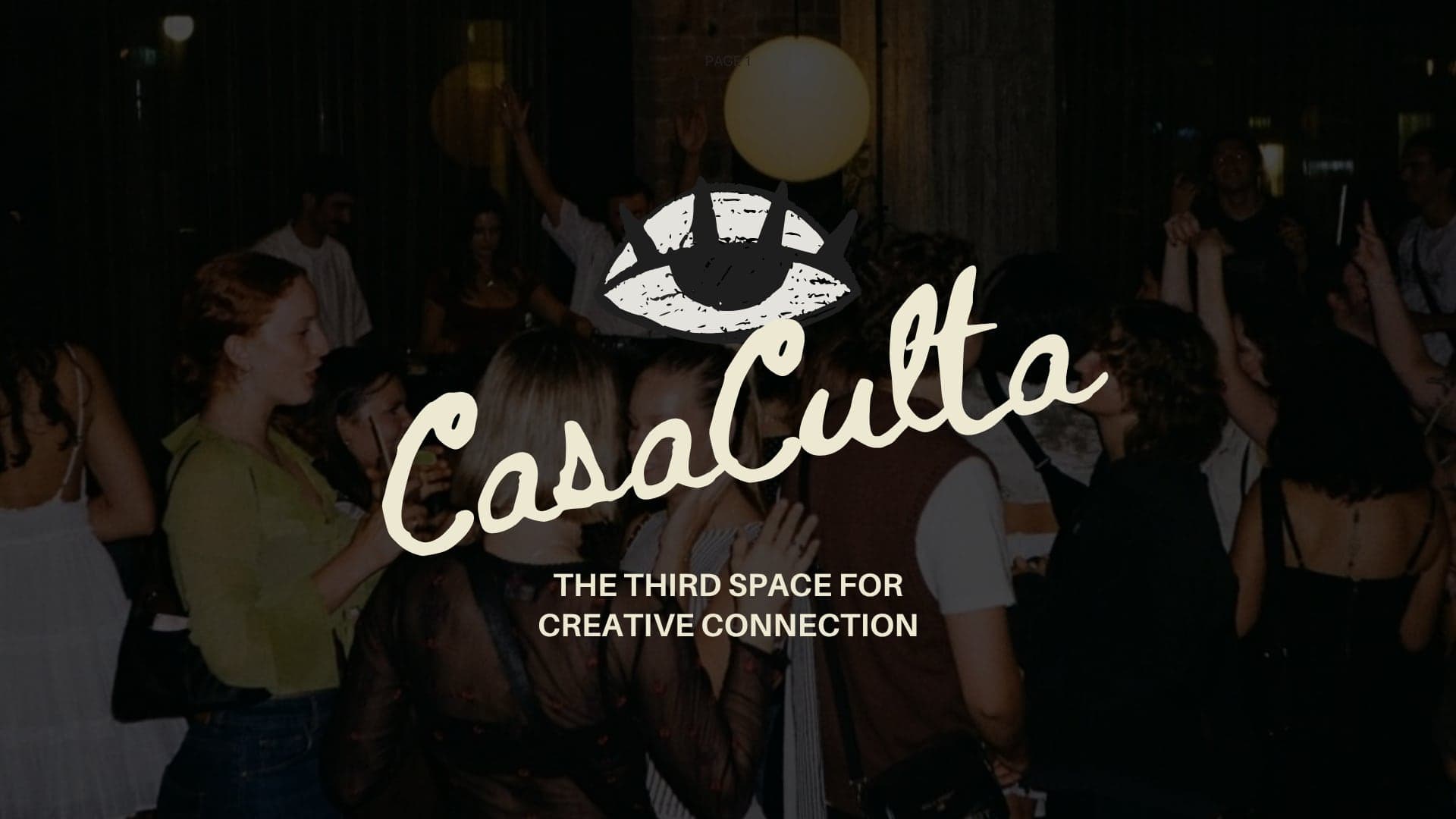
A cultural house for Barcelona’s creative community — café by day, wine bar by night, creative studios always. I developed it from first idea to a complete brand: strategy, naming, identity, and applications.
- Role
- Concept, naming, brand strategy, visual identity, creative direction
- Deliverables
- Brand book, identity system, brand film, website design, social media, menus, membership cards, merch
- Disciplines
- Brand Strategy · Visual Identity · Creative Direction · Digital Design
- Project
- Conceptual brand · M.A. final project, BAU Barcelona, 2026
02 — The concept
A place to belong, not another place to work.
Networking events trade business cards. Coworking is built for productivity. Great cafés are places to visit, not to stay. Every decision in Casa Culta answers one question: does this make a meaningful conversation more likely?
Hospitality
Café by day, wine bar by night
Creativity
Studios and workspaces for making
Connection
Talks, dinners, and open studios
03 — Visual identity
Hand-drawn, on purpose.
A hand-drawn eye — curiosity, recognition, a nod to the evil eye — paired with a script wordmark. Both are drawn by hand so the brand feels found on a Barcelona wall rather than designed in a manual.
Logo
Eye symbol + Beth Ellen wordmark
Primary logo

On Sand
On Salud
On photography
Symbol
Hand-drawn, and strong enough to stand alone over photography.
Wordmark
Beth Ellen script, set at an upward angle.
Typography
Hierarchy
Logotype & handwritten accents
Casa Culta
Aa Bb Cc Dd Ee Ff Gg Hh Ii Jj Kk Ll Mm Nn Oo Pp Qq Rr Ss Tt Uu Vv Ww Xx Yy Zz
Beth Ellen
Headlines
No era el plan, pero aquí terminaste.
Aileron Bold
Body
The third space for creative connection. Café by day, wine bar by night, creative studios always.
Aileron Regular
Editorial accent
Not quite a members club.
Morisawa Role Serif
Color
A Mediterranean palette, drawn from the space

Culta Green
#4A501E
Olive, plants, the courtyard

Salud
#722410
A toast — wine and late nights

Sand
#D6CBB6
Paper, plaster, daylight

Noche
#1E1E1E
After dark
Tone of voice
A friend who knows the city well.
Someone introducing you to their favorite place — the person who always seems to know what’s happening this weekend.
- Warm
- Curious
- Cultured
- Welcoming
- Never corporate
In the brand’s words
Not quite a café. Not quite a studio. Not quite a members club.
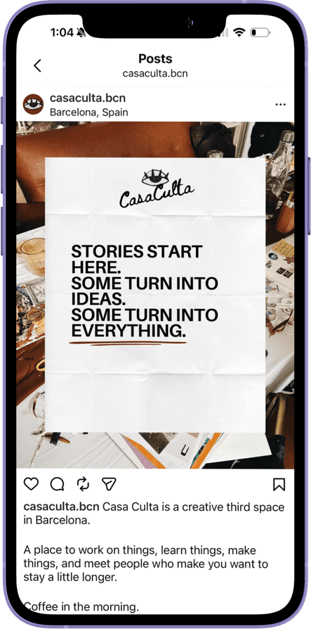
Stories start here. Some turn into ideas. Some turn into everything.
No era el plan, pero aquí terminaste.
04 — Brand applications
From the website to the coffee cup.
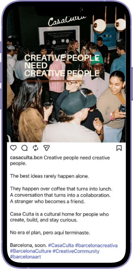
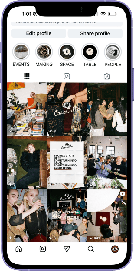
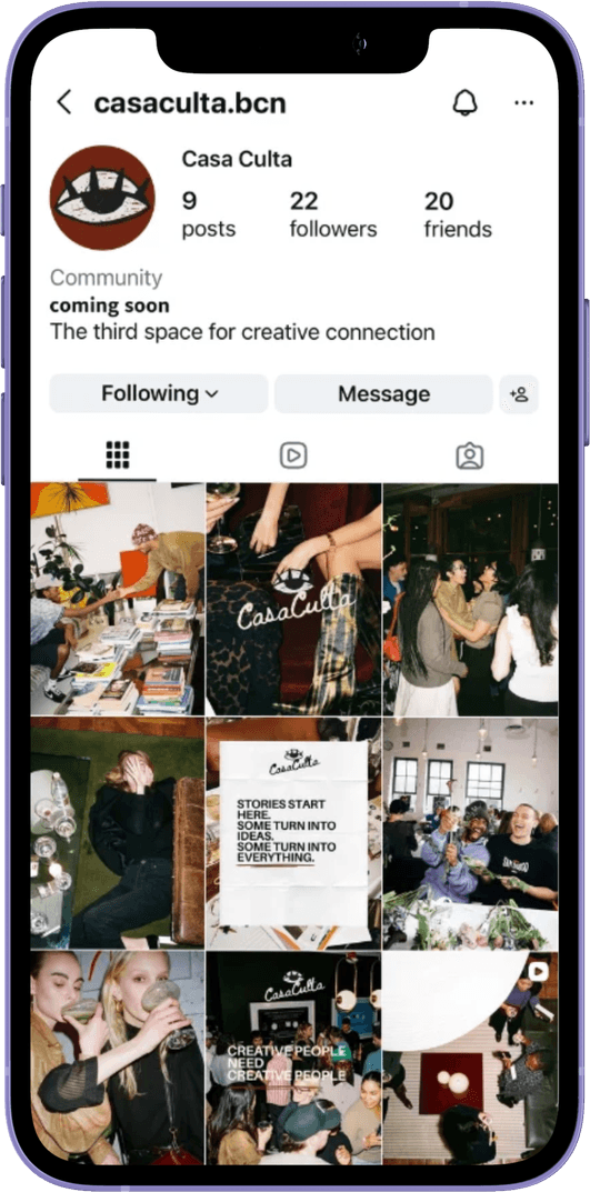
Dim, warm, and a little undone online; the eye carries across every printed object.
Website
Live — scroll inside the window
Social media
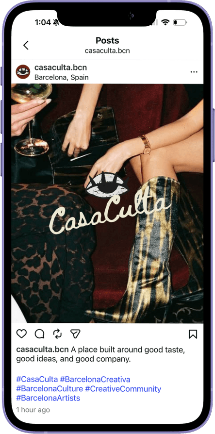
@casaculta.bcn
Brand film
Born from the streets
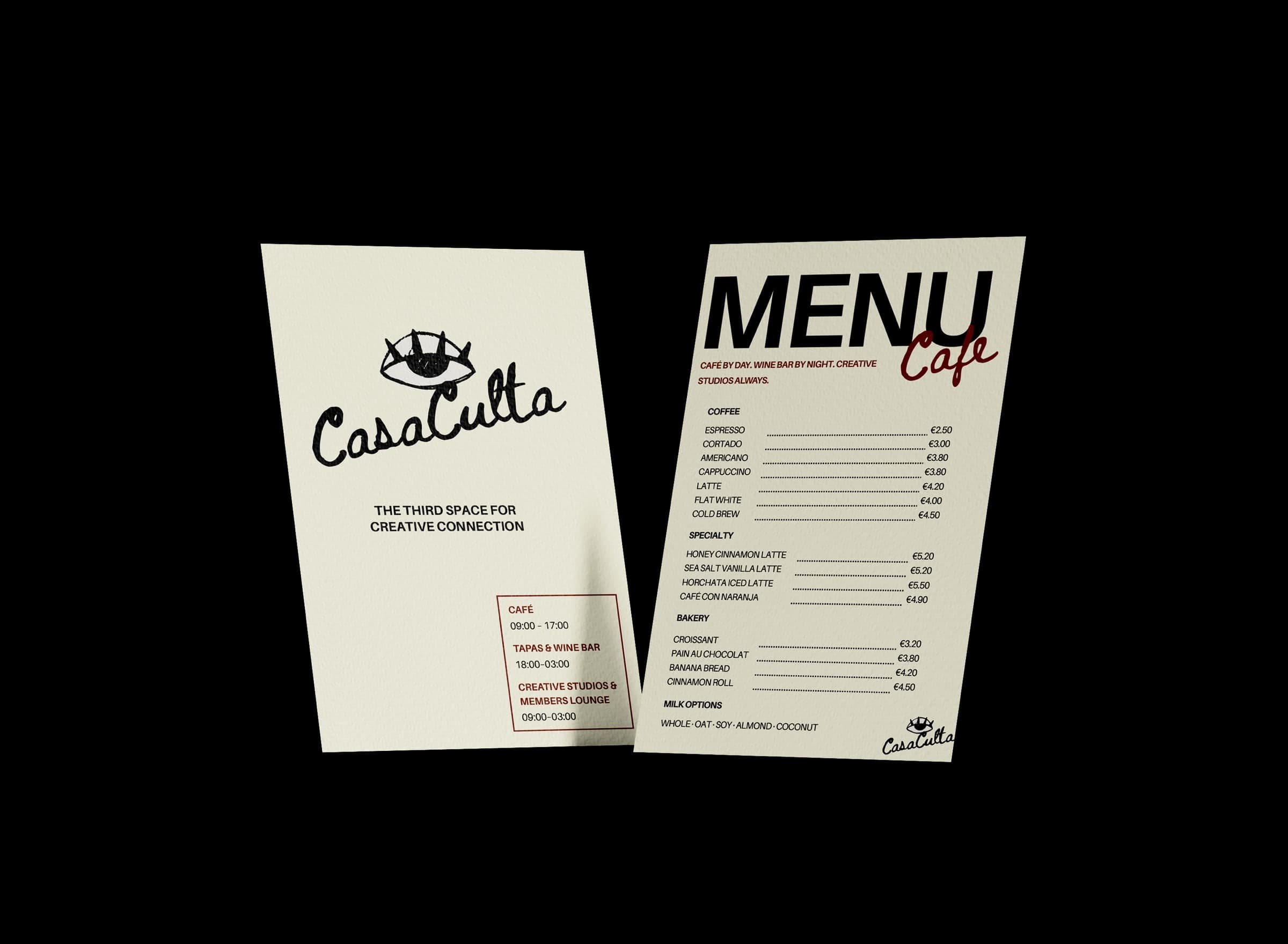
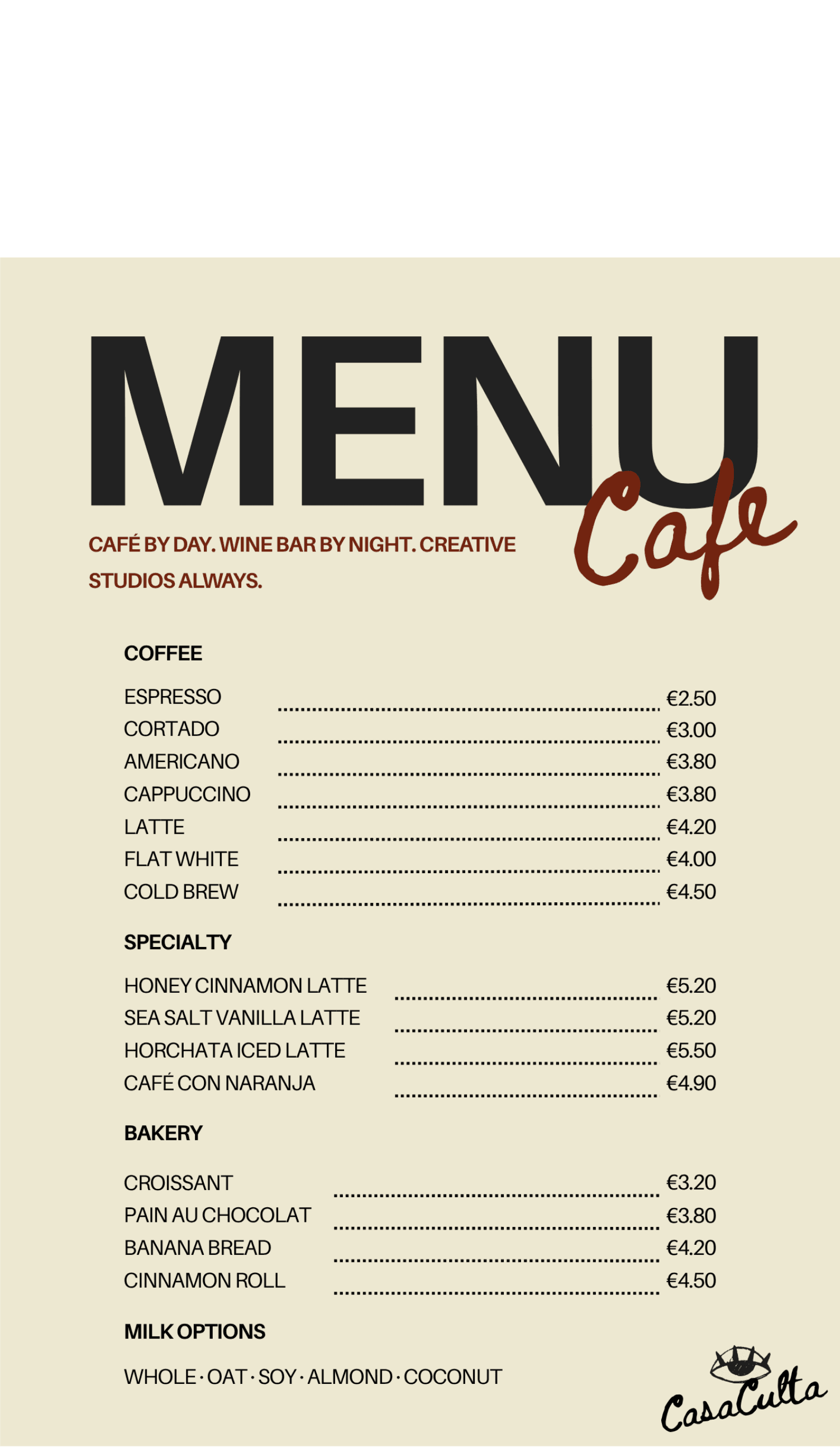
Menus
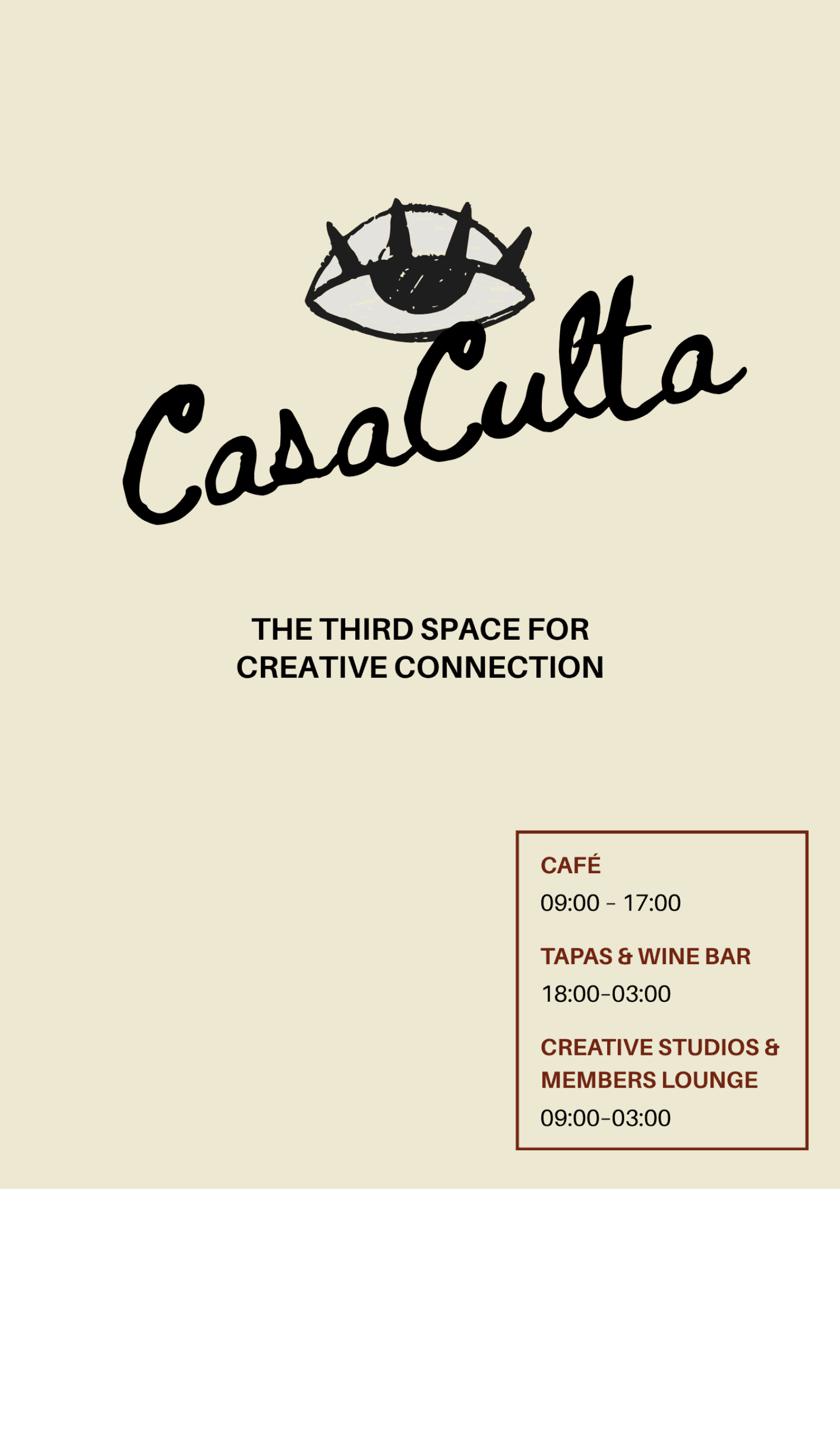
Hours card & café menu
Printed
Artwork
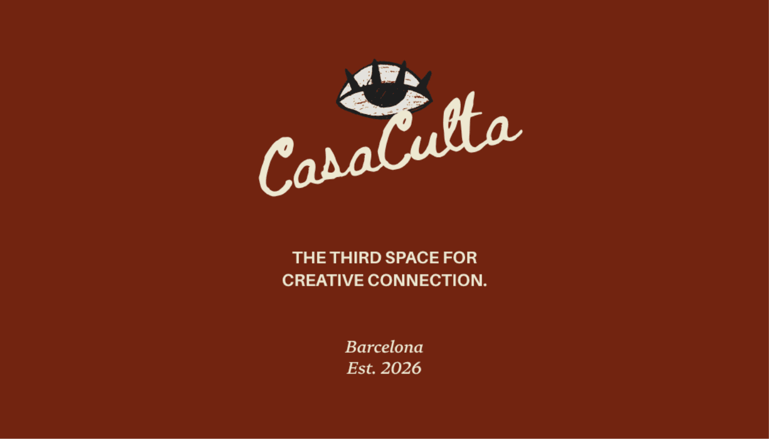
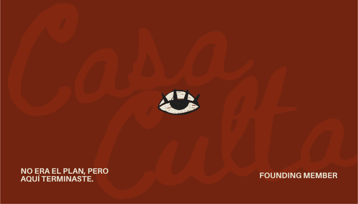
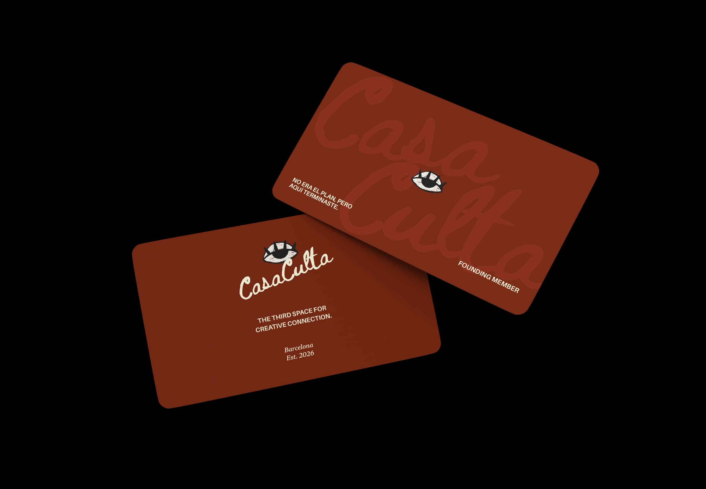
Founding membership card
Front & back
Printed
Café & merch
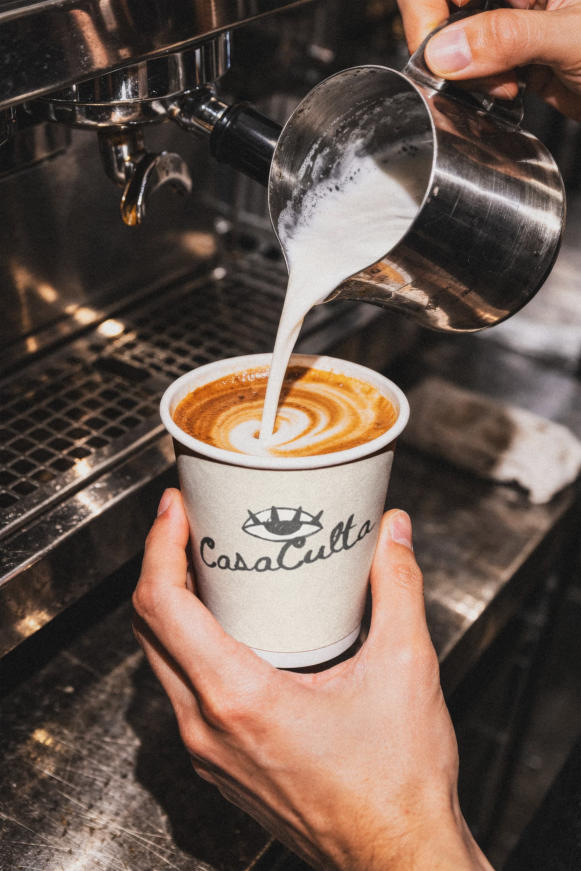
Takeaway cup
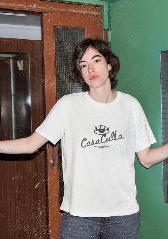
T-shirt
Atmosphere photography in mockups and the key visual is used to visualize the concept.
05 — Brand strategy
Built on belonging.
- Research
- Survey of 15 Barcelona creatives (Nov 2025), persona interviews, SWOT and competitor review
- Audience
- Creatives, freelancers, founders, and students aged 22–35 — locals and internationals
The opportunity
Barcelona has one of Europe’s highest concentrations of creative professionals, yet few places where they can meet repeatedly, informally, and without an agenda. Networking events trade business cards, coworking produces silence, and the cafés with real atmosphere are full by late morning.
What the research revealed
None of the creatives surveyed worked from a dedicated creative space — they split between home, cafés, and offices. The concept scored a 4.6 out of 5, two-thirds said they would buy a ticket to an event before joining, and workshops and talks were the most requested experience. In their own words, they described the brand before it existed:
“Co-working spaces that do not look like a co-working.”
“Not a neutral space — needs a lot of personality.”
How it shaped the brand
- Positioning
- Not quite a café, not quite a studio, not quite a members club — a third space that brings all three under one roof.
- Personality
- The Creator, balanced by the Everyman: expressive and experimental, but never exclusive. One student warned that concepts like this “are usually for older people.” The brand was built to avoid that.
- Experience
- A café as the open front door, day passes before membership, and programming — talks, dinners, open studios — as the reason to come back.
Next project
Marfour International Law Firm
Marketing Communications · Brand Development · Digital Content